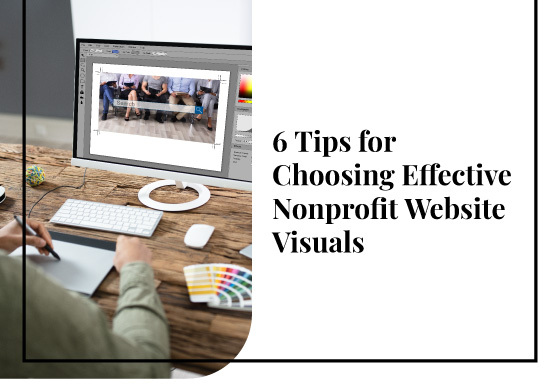
 Website visitors only need 50 milliseconds to form an opinion about your website. Visual appeal is the most important aspect of how visitors assess your website upon their first visit. That’s why you must choose your nonprofit website’s images carefully.
Research shows that website visitors are drawn to authentic images of real people—not decorative images or stock photos alone. As a nonprofit organization, your website’s images should also convey information about your mission and motivate visitors to get involved.
If you’ve recently audited your nonprofit website and determined that your website visuals need a refresh, use these six tips to select compelling images:
- Go for authenticity.
- Reflect diversity.
- Set quality standards.
- Leverage A/B testing.
- Use infographics to illustrate concepts.
- Brand images effectively.
According to Kanopi’s guide to the best nonprofit websites, the most effective website visuals empower everyone, from long-time supporters to first-time visitors, to take action. Let’s take a closer look at how you can choose visuals that do just that by supporting your mission and helping to grow awareness of your cause.
1. Go for authenticity.
Just like any marketing campaign you create, you should prioritize choosing genuine, engaging photos of real community members, volunteers, and other individuals involved with your organization.
It goes without saying, but we’ll say it anyway: stock photos aren’t going to fit the bill. Using too much stock imagery throughout your website can hurt your credibility, reduce audience trust, and generally make your website look less professional.
So, if stock photos aren’t the way to go, how can you choose images that showcase your mission, convey emotion, and build credibility? We recommend assembling a photo catalog of original images that your organization owns the rights to. If you happen to have a photography whiz on staff, ask them to take photos at events or during volunteer opportunities. If not, it’s worth it to hire a professional photographer to ensure your photos are high quality.
This way, you’ll create a robust photo archive to pull from any time you’re looking to update the imagery on your website or in other marketing materials.
And, if you have the budget, consider illustration! Illustrators are great at creating original artwork to portray the mood and topic of an article. They can also create icons and a library of art that you can use for other areas of your website.
2. Reflect diversity.
Research shows that almost 80% of consumers worldwide expect brands to commit to showcasing inclusiveness and diversity in their advertising. Consumers aren’t interested in superficial attempts by companies and nonprofits to incorporate more diversity. They want genuine commitments that show that the organizations they support are prioritizing diversity and inclusivity.
That’s why you should choose website images that accurately reflect the diversity of your organization and surrounding community. You can do this by encouraging your photographers to take images that represent the diversity of ethnicities, races, genders, abilities, and ages present at your events. And, make sure they’re including everyone who’s at the event, not just your board members or nonprofit leadership.
This ensures that your nonprofit’s audience can see themselves represented in all aspects of your work. But remember that updating your imagery to reflect diversity should be just one element of your overarching inclusion strategy. The more your nonprofit strives for greater inclusivity, the easier it will be to create a website that reflects that image.
3. Set quality standards.
 Your website’s load speed has a major impact on your conversion rates. Sites that load in one second have a conversion rate three times higher than a site that loads in five seconds.
Large, clunky images that take several seconds to load significantly slow down your pages and lower your conversion rate. Therefore, any images you choose should be compressed and optimized to ensure they load as quickly as possible.
Whether you’re working with Drupal or WordPress, you should be able to compress images right within your CMS. You can also use simple, free tools like TinyPNG to compress images. Set resolution standards so any images used on your website are crisp and quick to load.
4. Leverage A/B testing.
A/B testing is a valuable website planning and development strategy that can help you optimize your visuals. In this process, you’ll create two different web designs and assess which is more effective for engaging visitors.
To help you choose effective website visuals, you can design two different versions of important pages like your online donation page or about us page to determine which receives more engagement.
To conduct an effective experiment and understand which changes actually made a difference, keep these best practices in mind:
- Only change one page element at a time, or you won’t be able to isolate the most impactful changes.
- Make significant enough adjustments that you will actually be able to see a change in engagement or traffic patterns.
- Don’t assume that a positive change on one website page will automatically have the same results on a different page. For instance, your audience’s reaction to the images on your homepage might be completely different from their response to the visuals on your about page.
Throughout this process, you might find your initial assumptions about what type of images to use were off base. With thorough testing, you can be more certain that you’re only moving forward with the most effective strategies.
A/B testing can be a time-consuming process that takes a while to get the hang of. If you feel like you need a helping hand, consider bringing a web consultant on board. These professionals can conduct ongoing A/B testing and make strategic recommendations based on your unique audience profile.
5. Use infographics to illustrate concepts.

Of course, not all of your website visuals have to be images of people. Infographics can be highly valuable for explaining complex concepts or illustrating information.
To ensure you’re using the most effective infographics possible, follow these best practices:
- Make infographics useful and actionable. Know your audience and what information they’re looking for. For instance, check out this infographic from Save the Children. It succinctly describes the impact of the Syrian war on children, providing useful information for those who are interested in learning more about the crisis. Then, it offers audience members an immediate way to help.
- Keep it simple. Overloading your infographic with too much information can make it cluttered and confusing. Choose just a handful of concepts you want to convey along with icons or small illustrations that explain them further.
- Remember color theory. Keep basic color principles in mind when designing infographics. For example, contrasting colors make for effective background and text color combinations. Check out this infographic from Oxfam that makes use of color pairings like blue and orange and purple and yellow.
The human brain can process visual information 60,000 times faster than written information. When your infographics are optimized to share information as simply and quickly as possible, your website content will be more engaging and informative for new and existing supporters alike.
6. Brand images effectively.
Above all, it’s important to align your images with your mission and messaging. Any photos you choose should adhere to your nonprofit’s unique style, tone, and message.
Set digital branding guidelines to help your team members make choices when deciding between multiple image options. Double the Donation’s nonprofit web design guide recommends setting standards regarding various aspects of an image, including:
- Sizing: How will you size images such as blog post feature images or testimonial portraits? Set standard sizing guidelines to keep your visuals consistent and everyone uploading site photos knows what size to choose.
- Formatting: Should images be uploaded in JPG, PNG, SVG, or a different format? Set formatting regulations so there’s no uncertainty.
- Look: Do you want your images to have a certain tone? Consider including recommendations on the types of images to choose for certain website pages or marketing materials. For instance, you might want to choose images of people smiling and chatting for your event recap blog posts, but incorporate more somber imagery into your online donation form.
- Sourcing: How can staff members access your internal image catalog? Or, if you do choose to include a minimal number of stock images on your website, where will you source them from? Include instructions on how to use filters in order to find images that represent a wide range of people.
- Branding: Your infographics, especially your high-value ones, should be branded with your organization’s logo, colors, and font. Take elements from your overall nonprofit branding strategy to establish infographic specifications. For example, you might establish the standard of having your logo in the upper left corner of every infographic, or you might specify which brand colors should be used in infographics.
These guidelines will help staff members choose or create the right type of website visuals and other marketing materials. You can create visual harmony throughout your website to keep visitors’ attention on your mission.
The images you choose for your nonprofit’s website matter. They should convey your mission, speak to audience members, and provoke emotion. By using these tips to choose images strategically, you can ensure your visual content is telling your story accurately.
About the Author:
 As Founder and CEO of Kanopi Studios, Anne helps create clarity around project needs, and turns client conversations into actionable outcomes. She enjoys helping clients identify their problems, and then empowering the Kanopi team to execute great solutions.
Anne is an advocate for open source and co-organizes the Bay Area Drupal Camp. When she’s not contributing to the community or running her thoughtful web agency, she enjoys yoga, meditation, treehouses, dharma, cycling, paddle boarding, kayaking, and hanging with her nephew.


Leave A Comment