First impressions mean everything in the nonprofit world, from the staff you hire to how prospective donors perceive your organization. When it comes to nonprofit web design, this principle is no different. In fact, 94% of first impressions of a website are design-related, meaning that the visual elements of your website can have a huge impact on whether site visitors stick around or navigate away from your website and organization altogether.
To make a solid first impression online, you need a captivating web design that draws supporters in and encourages them to take action, such as by registering for your upcoming event, applying to volunteer, or donating to your cause.
Use these top tips to upgrade your visual design and create a beautiful website that will engage and inspire visitors:
- Incorporate your visual branding
- Follow accessibility best practices
- Prioritize simplicity
To make revamping your website a breeze, leverage a content management system (CMS) designed with nonprofits in mind. Morweb’s guide to nonprofit website builders recommends investing in a solution that offers drag-and-drop editing, built-in accessibility tools, and mobile-optimized website templates so you can create a responsive, visually appealing web design with ease. Armed with the right CMS, you’ll be in great shape to meet your organization’s digital goals.
Incorporate your visual branding
Your brand represents who your nonprofit is and the kind of work you’re doing to make a difference in the community. Web design branding can be broken down into two main categories: verbal branding and visual branding.
Verbal branding refers to the messaging and tone you use to describe your mission and organization, while visual branding encompasses the non-text elements you use to make your website stand out. Even if you have the most amazing copy, people won’t feel inclined to read through your content if your website doesn’t look the part!
The top nonprofit websites feature the following visual branded elements:
- Logo: Your logo should have a simple yet memorable design that lets any visitor know that your website belongs to your organization. Prominently place your logo across your website to boost awareness, such as placing it in the top left or right corner.
- Fonts: Use the same header and body fonts throughout your content to create a cohesive viewing experience. If you’re thinking of revamping your fonts, consider using sans-serif fonts like Arial or Helvetica, which are very popular for websites because of their straightforward nature and legibility.
- Color scheme: Color can have a huge impact on your supporters’ perception of your organization, so it’s important to select two to three colors that aesthetically complement each other and speak to your nonprofit’s brand. For example, blue is often associated with trust, red is tied to immediacy, and yellow is associated with optimism. Think through your values and which colors would best represent these. It can also be helpful to incorporate colors that are associated with your cause to increase visibility. For example, many breast cancer organizations use pink in their branding.
- Visuals: Visuals, like photos, videos, and graphics, add to your supporters’ viewing experience and make your website more engaging. For example, you might feature a fundraising video on your donation page to appeal to supporters or include photos of your beneficiaries on your homepage. Showcase visuals that speak to your nonprofit’s identity, values, and the great work you’re doing in the community.
Keep in mind that many of your supporters will navigate to your website from their mobile devices, so it’s critical that you develop a responsive design. This means that your visual elements should adjust to look good on any screen size, from a wide tablet to a phone as small as your hand. With the right website builder, you can automatically mobile-optimize all of your webpages, saving your team plenty of time and energy that would otherwise go into hours of coding.
2. Annual filing requirements
To strengthen your visual design, you need to adhere to web accessibility best practices. This involves making your content accessible to people of all abilities, ensuring that everyone can readily interact and engage with your visual content.
The World Wide Web Consortium (W3C) created and maintains international standards for web accessibility, known as the Web Content Accessibility Guidelines (WCAG). Here are the four foundational principles that make up the WCAG:
- Perceivable: Your content must be presentable in ways that all of your users can perceive. For example, users with visual impairments may not be able to see an image of a beneficiary on your homepage, but an alternative text description helps them understand what the given image is and how it relates to the rest of your content. For visuals with audio like video and podcast, you should supply users with transcripts and closed captions.
- Operable: Operable content means users can interact with all elements on your page. For example, if you have a call-to-action button on your homepage that points to your donation page, this button should be clickable and take users to your donation form. Your site should also offer users enough time to engage with on-page elements. For example, if you have a moving carousel of images, give visitors plenty of time to view them by ensuring that each image will remain on a user’s screen for several seconds.
- Understandable: Understandable content is predictable in its design and creates a smooth navigation experience. For example, you should feature a well-designed navigation bar at the top of every web page so users can easily jump from one resource to the next. You should also use a heading hierarchy, so your content naturally flows from H1 headings to H2, H3, and so on.
- Robust: Your website must be compatible with different browsers and assistive technologies. For example, if a user with visual disabilities is using a screen reader, they should be able to hear your alternative text for visual elements read aloud to them.
Creating an accessible web design will help you develop a welcoming, inclusive culture at your nonprofit. Plus, when people have a positive user experience, they’re more likely to explore your website and take steps to get involved in your nonprofit’s mission. Work with a website builder that is WCAG certified so you can automatically prioritize and infuse accessibility in your web design.
3. Consequences for failing to file
As you revamp your website, it might seem tempting to add in a wide variety of high-value images, videos, and other visual elements. However, NXUnite’s guide to nonprofit web design explains that adding too much can overwhelm your audience and cause site visitors to click away. A minimalistic design gives your supporters a chance to breathe and digest your content, while still keeping engagement levels high.
Follow these tips to create a simple visual design:
- Use ample white space: Reasonably space apart your on-page elements to avoid clutter and create a smooth viewing experience. White space creates a minimalistic and clean appearance, contributing to your sense of professionalism.
- Limit distractions: Avoid unnecessary pop-ups, animations, and flashing content. This can distract your users and even lead to a frustrating user experience.
- Create user-friendly forms: Your website should house several important forms, including your donation page, volunteer sign-up application, and more. Make sure these forms are visually simple and easy to fill out by limiting the number of prompts. This increases the likelihood that users will submit these forms and support your mission.
To take the guesswork out of your web design, leverage a website builder with ready-to-go website templates. This way, you don’t have to worry about overcrowding your visual elements and wondering where to place them on the page; simply select a template, upload your content, and push it live.
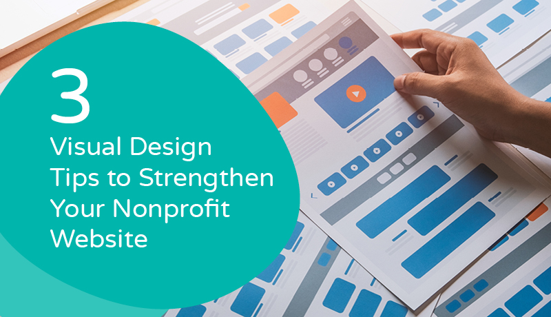
The Bottom Line
A website with a strong visual design can help your nonprofit amp up its fundraising efforts, grow its reach, and take your digital strategy to new heights. However, leading the charge on upgrading your visual design, with no technical support, can eat up your nonprofit’s time and energy. Do your research to invest in a comprehensive nonprofit CMS that will streamline your web design and make it simple to feature your signature brand.
About the Author
Murad Bushnaq is the Founder and CEO of Morweb. Since its inception in 2014, Murad has acted as Creative Director and Chief Technologist to help nonprofits spread their vision online through engaging design, intuitive software and strategic communication.