It’s one of the most overlooked places to seal the deal with your donor: the fundraising landing page.
This valuable piece of online real estate is where the donor goes to take action and give your organization money.
If it’s done well, you’ll get a gift. If it’s too short, too long, boring, or confusing, you won’t.
Your fundraising landing page is a perfect opportunity to make a strong connection with your donor. And that strong connection is what motivates people to give.
The page should affirm that, yes, they believe in your mission. They want to be a part of making it happen. They want to give to support the cause.
But as important as fundraising landing pages are, they are often dull and transactional.
“Click here to put in your credit card information. Here’s our mailing address if you want to send a check. Blah, blah, blah.”
Or worse, “We’re a 501c3 nonprofit….”
Your fundraising landing page can do so much more for you. Don’t squander the opportunity!
Let’s take a look at what makes a successful, powerful fundraising landing page so you can make sure yours are working for you to bring in the most donations possible.
Components of a Successful Fundraising Landing Page
Most people don’t think of a fundraising landing page as anything other than a place to send people to give.
But it actually is a critical part of the fundraising process.
There are two parts to the act of giving a financial gift – the emotional part and the practical part. And this page needs to address both.
The emotional part comes when your page assures the donor that they’re in the right place and that their donation will make a difference.
It’s also about how the page looks, making the donor feel at ease with the donation process and confident that your organization is a good fit for them.
The practical part is about making the whole process simple and easy.
It’s also about giving the donor choices in how much they give and information about where their money is going. (Donors like knowing that!)
It’s a critical page, yet it’s often designed last, with very little thought. And once it’s set up, it’s not usually changed or updated.
And that’s a huge mistake!
As a fundraiser, you should get in the habit of reviewing and updating your fundraising landing page frequently, especially before you send out an appeal.
Ok, now that you have a basic understanding, let’s take a closer look at the individual components you should have on your fundraising landing page.
Component #1: Strong, clear statement about why the donor should give
Yes, the donor has already taken the first step to donate: they’ve gone to your fundraising landing page.
But you need to confirm for them that they’re in the right place and do it with a strong, clear statement about why they should give.
Here are some examples:
Feed your hungry neighbors
Give the priceless gift of education
Give a veteran hope for a brighter tomorrow

The first thing a donor should read should be short and punchy, pulling them in a little. It needs to be big and bold and right at the top of the page so it’s easily seen.
This one sentence sets the stage for the rest of the page.
Now, this is not necessarily an easy sentence to write. You may need to think about it and draft about a dozen versions (not kidding) before you land on the right one.
Spend the time to get this right – it’s THAT important!
Component #2: A short paragraph that nudges the donor toward giving
Once you’ve hooked people in with your headline, it’s time to fan the flames you’ve kindled in their heart with a very short paragraph designed to pull them in even closer.
Don’t mention your fundraising goal, your campaign goal, or your impending budget shortfall. These concerns are not your donor’s problem.
Instead, tell your donor why they should give like this:
“With your gift of $37, you provide a warm place to sleep for one night, and a chance for a person to come in out of the cold. Your support shows them they are not alone and that someone cares about them.”
“Help us eliminate our waiting list! 52 more students need scholarships and each one is just $142. With your help, we can get every student in school this year.”
“Veterans should be embraced by our community after their service, not cast aside. Let a veteran know you value and support them. Your gift of $59 covers one therapy session for a veteran recovering from physical or emotional trauma.”
Again, take the time you need to carefully craft this paragraph. Here’s where you can give a tiny bit of context about why the donor’s support is so important.

This paragraph should solidify the donor’s decision to give.
Component #3: Options for donations
Now that your donor is locked in, it’s time to give them options for giving.
After all, donors love options!
And it’s much better to have them thinking about what level they want to give at, not whether they want to give at all.
Getting the donation form just right is tricky. You want to give your donors choices, but you want to keep everything super simple.
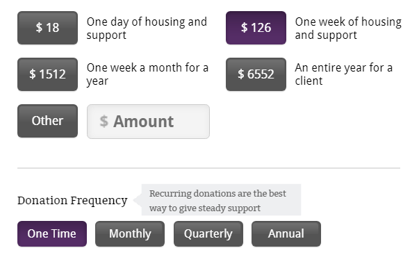
Offer donors suggested amounts. Instead of nicely rounded numbers like $20, $50, and $100, use your Core Number and the real costs for services and items your organization provides. For example:
$81.33: Emergency Food and Hygiene Kit for one family for a week
$164.23: Sponsor one student for a month
$1,977: Be a hero! Support one student for an entire year!
You can use your Core Number to give multiples or offer people options at a variety of levels like this:
$543: Care for one horse for a month
$275: Veterinary farm call for non-emergency care
$100: Draft horse hoof trim
$48: Two bags of grain
$18: Full care for one horse for one day
Notice how this organization went in descending order with the priciest option first. The psychology behind it is that it puts the smaller donations into context and makes them look really doable compared to the really pricey ones.
Next, of course, you give your donor the option of making a donation of the amount they choose. Usually this is an “Other amount” option.
Then, give them the option to make their donation monthly. Usually this is a small box or a drop-down option. You’ll be surprised how many donors will choose this option!

You can also give donors the option of contributing a bit more to offset processing fees. Most processors charge 3 percent, so this is an amount many donors feel comfortable giving.
Give the donor a place to let you know if the donation is in memory of someone or in honor of someone. This is very important to some donors, and you’ll frustrate them if you don’t offer this option or make it hard to find.
Finally, at the bottom of the page after all the other options and the “Donate” button, give instructions on how a donor can send in a check if that’s their preferred method. Include who to make the check out to and where to mail it.
Just a little more information…
If you can collect a little information, that’s great but don’t be a burden. Don’t collect any information you don’t plan to use, and make everything simple and clear.
Component #4: Thank you page
 Immediately after the donation processes, send your donor to a Thank You page that thanks them.
This page is really important for the donor experience yet not usually given much thought. That means YOURS can easily stand out!
First, this page should thank the donor. Say THANK YOU in big letters, followed by a sincere note of appreciation that says something like:
“Thanks to you, more teens will be able to attend school and plan their careers. More teens will have the support of loving mentors and other teens who share their goals. More teens will grow into proud, capable adults who will build a stronger Haiti!”
Choose a special image for this page – a happy image that “says it all” about the why of your nonprofit so that the message and the image match.
Remind them again how their donation will make a difference. If their donation was for a specific appeal or campaign, reference that here to tie everything together in the donor’s mind.
Next, invite the donor to learn more or get involved. Don’t overdo it here – just a few options will work.
Invite donors to sign up for updates from your organization (ahem, your newsletter) if you did not already do so on the donation page.
Offer donors additional information that they can download to learn more, like your latest annual report, latest financial statements, or any other PDFs that might interest them.
Share any volunteer opportunities that are currently available as well as upcoming events.
You’ll need to update this page and keep it fresh so a donor in 2021 doesn’t see an annual report from 2018.
This is the last page your donor will see before signing off, so make it count!
Campaign Consistency
For many organizations, their donation page is stagnant.
They never make changes. Yet your nonprofit’s work is always moving and evolving. Your donation page should evolve as well.
Your page should reflect your current programs, needs, goals, and campaigns.
When you have an appeal or campaign running, your donation page should reflect the appeal or campaign’s branding.
Donors should immediately know they are in the right place by the branding and tagline that greet them. In short, what they see on the fundraising landing page should match what they saw in the appeal.
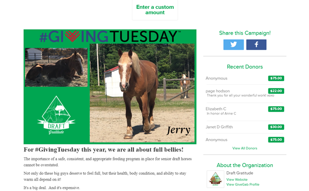
For example, when you promote your Giving Tuesday campaign, you likely are using the widely recognized Giving Tuesday woven heart logo. You have probably created special graphics and a slogan for your Giving Tuesday campaign.
So when your donors go to your donation page to give on Giving Tuesday, they should see that branding so they know they are in the right place.
And when Giving Tuesday is over, replace the Giving Tuesday branding with end-of-year messaging right away.
Having outdated information on your website is a huge red flag for donors because it sends the message that you aren’t organized which tears down trust!

What NOT to do with your fundraising landing page
You don’t get a second chance to make a first impression, so be sure to get your fundraising landing page RIGHT!
Here are some common mistakes you should avoid:
The Bottom Line

An attractive, well designed fundraising landing page will affirm that the donor is making the right choice to give to your nonprofit.
They will appreciate that the donation process is smooth and that the organization is humming with purpose. Giving to your organization feels like a wonderful extension of their values and their passion.
With a stellar fundraising landing page, you’re building the relationship in the right way, giving them a great experience. You can follow that up with a wonderful thank-you email, regular updates via email, a compelling annual appeal via mail, and other warm touches, maybe even a handwritten card sometime during the year.
All of these little touches work together to build a strong relationship with the donor, one that will pay off for years to come.
By providing a smooth donation process and following up with a warm thank-you page, you will have more repeat donors, raise more money, and change more lives. And that’s what it’s all about.,
Find some great examples of donation pages, landing pages, Giving Tuesday pages, and Thank You pages inside Fundraising TV. Learn more and sign up now.


Leave A Comment