
Every nonprofit website visitor is a potential donor.
And we all want more donors, right?
By telling the right stories in the right way, you can lure visitors to your donation page and inspire them to give.
But it’s not as easy as it sounds.
The challenge is grabbing your visitor’s attention.
You don’t have much time to do so.
Studies have found that most website visitors leave within 10 seconds, and the vast majority are gone within 20 seconds.
It’s not much time.
That means your website must be clean, clear, and easy to navigate.
And if your site is compelling enough to keep your guest interested for 30 seconds, you have a good chance of convincing them to explore for two minutes or more.
If you can tug at their heartstrings during those critical first few seconds, a well-designed site will lead your nonprofit website visitor straight to your donation page, where they will feel moved to contribute.
Just like I have visited retail sites and impulsively purchased something that caught my interest, I have donated to organizations I knew very little about just by visiting their website.
Why?
Because the site convinced me that the organization was working to solve an urgent problem and that my gift would make a meaningful difference.
Something in the photos and the language on the page pulled me in and made me care.
I have been moved to give by the simple, human decency of an organization that sends volunteers into the streets and under bridges to offer food, clothing, and tents to people who call the streets home.
I have been inspired by a nonprofit that tackles a small aspect of a huge problem like providing pet food so people going through hard times can keep their pets.
I have given to an organization that provides education and wrap-around services to teenagers in a developing country so they can have a chance at a brighter future.
Something in the organization’s story stirs my heart, and the next thing I know I am on their donation page filling in my credit card number.
To get this reaction from more visitors to your site, you first need to tell the right stories in the right way. Then you need to design your site to lead your nonprofit website visitor to your donation page.
From there, you can structure your donation page so visitors will want to give.
Tell the Stories That Will Make Your Nonprofit Website Visitor Want to Know More
 When a nonprofit website visitor lands on your home page, what can you show them to grab them right away?
(Remember, you have 10 seconds!)
A photo accompanied by a concise story or a short video with an attention-grabbing headline should be right there to introduce your visitor to the essence of your organization’s work.
This is NOT the time to say “We’re a 501c3 nonprofit…” or regurgitate your mission statement or share a lot of jargon. It’s also not the time to invite people to purchase event tickets or buy something from your Amazon wish list.
It’s best to start with a short story. Let’s call it an anchor story since its job is to anchor people on the page, keeping them on the site as long as possible.
The ideal anchor story cuts to the heart of what you do. It captures the struggle of those your nonprofit serves. It demonstrates your organization’s unique approach to addressing a community problem.
Here are some ways to create a strong anchor story:
- Identify a story that demonstrates what your nonprofit is all about. If you are an animal rescue, show an animal getting rescued. If you are a food bank, show volunteers giving away food. If you provide opportunities for children, show children getting opportunities they might not otherwise have. Don’t lead with a photo from your latest fundraiser. This does not tell the visitor what you do and it will NOT keep people on the page!
- Use the best photo you can to illustrate your story, while protecting everyone’s privacy. Some people will agree to be photographed if asked. They will even sign an agreement to have their likeness used for marketing purposes. But you can tell the story visually without showing the faces of people receiving services. Get the best quality photo you can. The newer the cell phone, the better the photo. Maybe you have a professional photographer among your volunteers who can help with this.
- If you can create a short video, even better. Keep the video to about 30 seconds or less. The video does not have to be professionally made – thanks to YouTube and Facebook, people are used to raw videos and honestly, an unpolished video is more authentic. Just be sure the video is clear, of good quality, and shows what you do. The video should not be about your organization’s history or recent fundraising event.
A volunteer describing a moving experience can be effective. A person who received services telling how the organization helped them overcome a challenge is even better.
- Write a headline for your story that tells the visitor what your organization does. For example, if your photo and accompanying story show a young person in your program delivering groceries to an older person, go with, “Older people count on our students to bring their groceries .” For a video tour of your food pantry, try something like, “Neighbors get food along with a smile from volunteers.”
- Tell the story in a copy block next to the photo or in a caption to your video. You don’t need to provide a lot of detail, just the telling details that get to the heart of your work. Tell the story in a way that lets the visitor know right away what your organization is doing to solve a particular problem.
Here is an example of a story for a nonprofit website:
Mary has been our star reading tutor for seven years. Among the people she has supported in improving their reading skills: a veteran, a grandmother, a bus driver, and a mother who recently emigrated from Yemen.
Mary fell in love with Nancy Drew books as a child and is excited to see her students improve their reading skills. “Once we get past the shame and lack of confidence in their reading, they advance quickly,” Mary says. A student she tutored for three years recently finished his first novel read for pleasure: ‘The Davinci Code,” by Dan Brown.
- Position your anchor story near the top of your home page. Make it impossible to miss, even if your visitor is only on the site for less than ten seconds.
- Now that you have an anchor story, add more stories and engaging content to your home page. Show different facets of your work. If you have a longer story you want to tell, give a summary on the home page and then provide a link to an interior page with the full story and additional photos.
- Include graphics only if they are easy to understand. If you use a graphic to explain the depth and nature of the problem you are looking to solve, make sure the graphic is clear and not confusing. Remember, most visitors are only spending a few seconds on your site. You want your graphics to help visitors quickly understand the issue.
- Keep your homepage fresh. Always be capturing new stories for your website, newsletters, and social channels. Make your anchor story your strongest story, the one most likely to inspire someone to give, even if it is not your newest story. Then fill out the page with fresh, informative, and inspiring stories.
Design Your Site to Lead Visitors to your Donation Page
 Now that you have a great story, you are ready to focus on the design of your website.
By keeping the needs of the nonprofit website visitor in mind, you can give them content they’re interested in, move them to where you’d like them to go, and ultimately, get more donations.
- Put the donate button right at the top of your homepage. Make it big, and use a contrasting color (like red, orange, or gold). This is the quickest, easiest way to get donations. Make it impossible to miss!
- Put a donate button on every page of your site. Again, a nonprofit website visitor should never wonder how to donate! The donate button can be in your header or footer and in the navigation bar. Just make it obvious. Most people know what “donate” means but if you use different text like “support” or “get involved”, you might lose people.
- Put a donate button in other strategic locations. You can add a donate button at the bottom of your “About” page, at the end of relevant blog posts, and possibly on other pages where you tell powerful stories.
- Make sure your site is optimized for mobile. Many of your visitors will find you on their mobile phone, not their laptop. Make sure your site is easy to read and navigate when using a phone.
- Make sure pages load quickly. Few people have the patience for a slow-loading page. (I sure don’t!) You will lose prospective donors if they have to wait.
- Keep your navigation simple. Your website is a marketing tool — your most important marketing tool. It isn’t an encyclopedia of everything anyone might ever want to know about your organization.
- Make sure your branding is consistent throughout your site. Make sure your logo is on every page. Use partner branding sparingly. You want your visitors to get an impression of your organization. Keep taglines and messaging consistent throughout. You don’t want to create any confusion.
- Enable social media sharing. When visitors share your content on their social media, they drive more visitors to your site. And these visitors will be more likely to engage, because they heard about your work through a friend on social media.
If you are a small, new organization, you may be tempted to disregard web design as beyond your budget and skills. But, a well-designed website will pay for itself very quickly!
Several platforms such as Squarespace and Wix offer easy-to-build website options. A WordPress consultant specializing in nonprofits can advise you on options, build your site, and teach you to keep your site updated while offering troubleshooting services. Our go-to web designer is the team at New Frame Creative. They understand the unique challenges that nonprofits face and offer some very affordable options for first or second websites.
Remember, your website is your gateway to donors and prospects you don’t know personally and it needs to represent you well on every page.
Create an Irresistible Donation Page
Your donation page is the ultimate destination for your nonprofit website visitor! But getting them there is just the first step.
Once someone reaches your donation page, you must inspire them to give.
Too often, the donation page is a missed opportunity. Many simply feature just a drab form to collect credit card information.
A good donation page can be so much more! An irresistible donation page will get you donations.
Here are some ways you can make the most of your donation page:
- Remind visitors why you need their help. State the problem that your organization solves. This is about the lives you change, not your need to make budget.
- Choose an engaging photo or group of photos for your donation page. Sometimes it is hard to decide where to place your strongest photos, especially if your work is sensitive and strong photos are hard to come by. Put your strongest photos on your home page, and your second-strongest photos on your donation page.
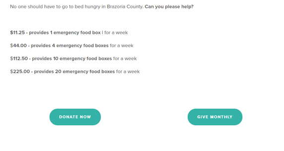
- Give donors a reason to donate. Tell prospective donors how their donation will make a difference. “For $82.50, you can provide education, room, and board for a student for one month.” Using a Core Number can make a powerful ask and you can calculate yours with our tool.
- Include all ways to give. Give visitors the option to give by credit card and PayPal. Include your address for donors who prefer to write a check. Provide a phone number in case they have a question, can’t get their donation to process, or need help. Also share information about corporate matching and other giving opportunities.
- Use a thank-you page. Immediately after completing the donation, send the donor to a thank-you page that thanks the donor and reminds them how their donation will be used. Show a happy photo of your organization in action, preferably one person or one animal being helped. Tell the donor that a receipt has been sent by email and should be in their inbox. And again, give them a phone number and email they can contact with questions or problems. This thank-you page confirms they made a good decision to give and sets the stage for how their experience will be with your nonprofit.
Here’s a simple yet powerful donation page from Copper’s Cat Commune:
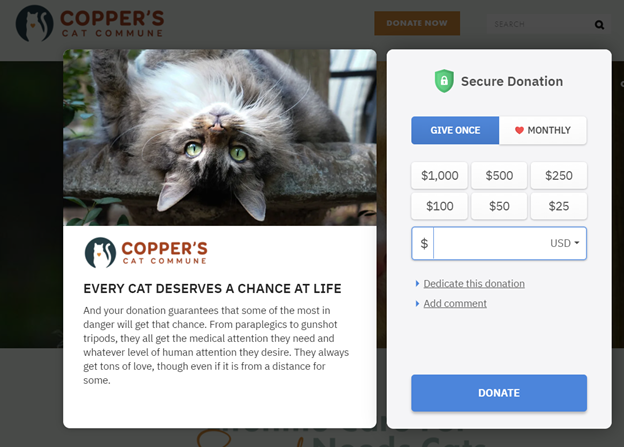
This one has multiple screens to it. Once you fill this part out and click the Donate button, another page pops up to ask for additional info.
Here’s another donation page from Gallup McKinley Humane Society:
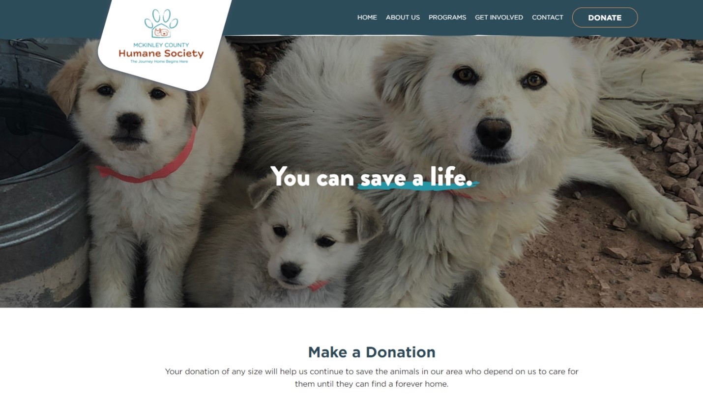
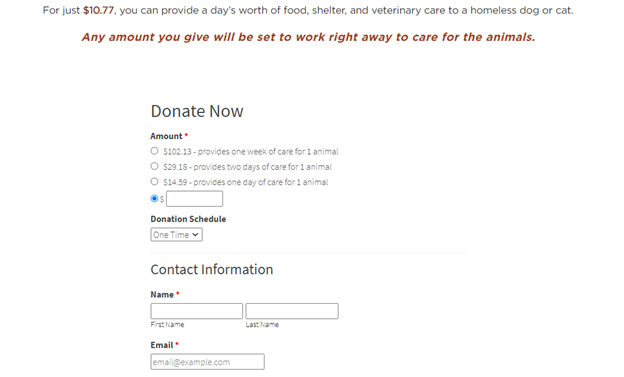
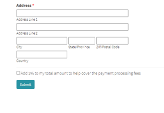
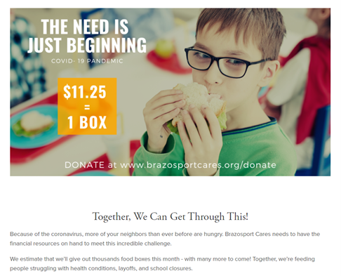
Here’s another good one from Brazosport Cares Food Pantry. Notice the photo/message at the top:
The Bottom Line
Your website is your most powerful marketing tool. Yet too often we treat our website like a flat, digital brochure. Bring your website to life with compelling storytelling and lead every nonprofit website visitor to an engaging donate page. You will gain new donors and volunteers, some of whom will become loyal supporters.
A donor-centered website is a significant time investment, but it’s an investment that pays off with more support and more money to change more lives. And that’s what we’re here for.


![Build a Nonprofit Website that Works [Steal These Ideas!]](https://getfullyfunded.com/wp-content/uploads/2012/09/AdobeStock_260038257-scaled-500x383.jpeg)


I have been following your work for a while and just wanted to say thanks. I work for a local education nonprofit in Syria and we are upscaling our efforts, . Your advice makes the process so much less intimidating
So glad this is helpful!