Websites are vital to keep new nonprofits running by enabling you to connect with donors, volunteers, and members that provide needed support. However, figuring out and implementing the exact features that lead your website’s visitors to become long-term supporters can require trial and error, especially for organizations lacking a tech background. But what constitutes a well-designed and successful website?
Nonprofit and association website design is often understood subconsciously. We react positively when we find a website with strong, well-structured design, but it can be difficult to articulate what made the design strong. You should take inspiration from websites that you enjoy interacting with and that offer a positive user experience, but understanding why those features create that experience will be instrumental in helping you upgrade your organization’s website.
To help your new nonprofit build a website that will continue to be useful as your nonprofit grows, this article will explore key elements you should know about and implement in your own design, including:
- Regularly Updated Content
- Accessibility Features
- Interactive Media
- Recurring Donor Options
- Matching Gifts
Many of these elements can be added to your website relatively easily with the write content management system (CMS), but if you find yourself running into technical issues, don’t be afraid to reach out to a professional nonprofit web design agency. Your website is one of your most valuable assets for engaging your donors, and leaving parts of it dysfunctional isn’t an option. Plus, the right web design experts can become a long-term partner in helping you craft a successful website for your new nonprofit.
1.Regularly Updated Content
Search engines like Google direct their users to active websites that regularly post new content, which means new nonprofits need to routinely update their website to attract new visitors.
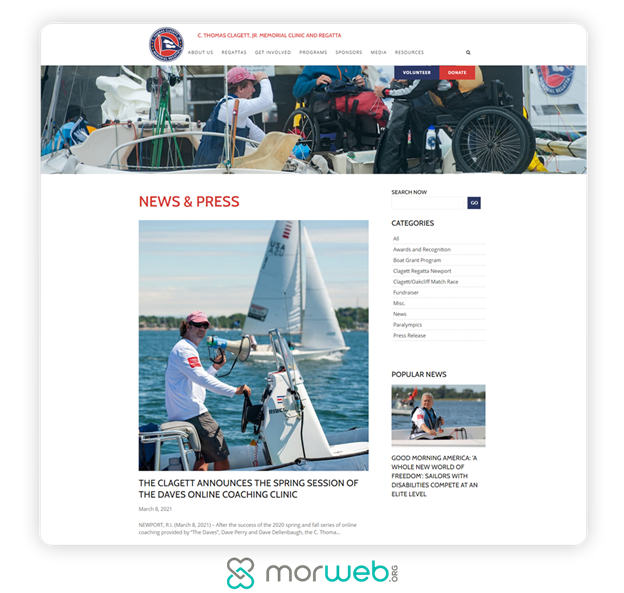
Fortunately, you won’t need to launch a new initiative and create a new program page every week to stay active online. New nonprofit websites have grappled with this problem for some time and have come to a few useful solutions, such as:
- Blog. Your blog can include posts, articles, and updates on your nonprofit’s field, your current programs, or anything else going on at your organization. Routine blog posts give your supporters regular content to interact with, drawing them to your website to see new posts.
- News. News pages can contain quick updates on current programs, marketing outreach about upcoming events, calls for volunteers, and other news items you want to share with your supporters. Some nonprofits embed a social media feed into their newspage, encouraging supporters to follow them on other platforms, while eliminating the workload of updating multiple news communication channels.
- Classes, webinars, and presentations. Informative content about your field takes more time and resources to develop. However, maintaining a library of useful resources can engage your current supporter base and provide new donors and members with a backlog of content to enjoy as they learn about your nonprofit. While these won’t be updated as regularly as your blog or newspage, they’ll continually interest supporters, building your authority as a leader in your field.
Supporters tend to lose interest in nonprofits that do little other than ask for more donations. Providing new content on a regular basis shows your supporters that your organization is active, makes a difference, and wants to form a community. Giving supporters multiple reasons to check your nonprofit’s website will also increase your traffic and improve the chances that your content will be linked elsewhere, driving even further attention to your cause.
2. Accessibility Features
Many nonprofit websites are required by law to be accessible. However, even if yours isn’t, it’s still in your best interest to implement accessibility practices, allowing your entire audience to engage with your mission.
Making your new nonprofit website accessible involves basic principles of web design such as clear navigation systems and readable font. When you design a usable website, you’ll likely include many accessible features without realizing it at first. However, a few accessibility design best practices you might miss are:
- Alternative text and transcripts. Visitors using screen readers and other assistive technology can’t interact with your images and videos in the same way as other visitors. Providing alternative text and video transcripts can help these visitors engage with your content.
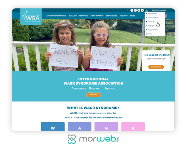
- Color contrast. Can your text be read on your website’s background color? Poor color contrast can make text unreadable for colorblind visitors. You can test your page’s color contrast by applying a greyscale, then checking if the text is still readable. If you’re placing text over a multi-colored background or image, use black text outlined in white or vice-versa to ensure it’s legible.
- Additional explanatory text for information fields. Some information fields such as search bars or entry fields on donation forms have text instructing visitors what information to put into the text box. However, that shouldn’t be the only place on the page explaining what visitors should do with the information fields, because users will lose their instruction guide as soon as they start typing. Place additional instructional text outside each information field to alleviate any confusion your users may have.
To ensure your nonprofit’s website is fully accessible, make sure it’s compliant with the Web Content Accessibility Guidelines (WCAG) 2.1, which serve as an official resource for organizations around the world.
You can also reach out to your CMS’s support team to review these guidelines and figure out how you can bring your website up to these standards. An intuitive CMS may even come equipped with an accessibility tool that allows visitors to adjust your site to greyscale, increase the text size, or adjust font legibility.
3. Interactive Media
How can you share all of your nonprofit’s essential information in a way that encourages visitors to further explore your website? Keep in mind that many visitors will evaluate your website in seconds. Paragraphs of text alone can be visually overwhelming and are unlikely to hold their attention for long.
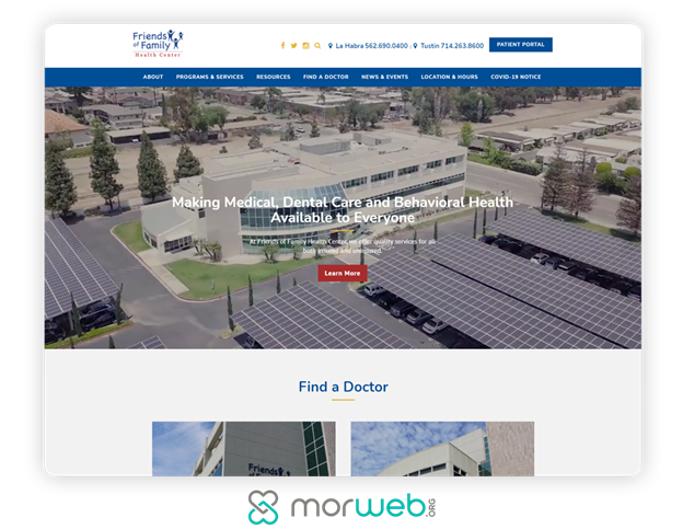
Interactive media helps attract attention and gives new nonprofits a way to share their mission as creatively as possible. There are many new nonprofits out there pursuing worthy causes, and you can make your mission stand out by showcasing it in a unique, colorful, and interactive way.
As you build your website, engage visitors by including interactive media such as:
- Photo carousels. Photo carousels are a rotating series of images that usually appear at the top of a website’s homepage to give new visitors an overview of the organization.
- Videos. Videos come in all shapes and sizes like multi-part webinars, interviews with your constituents, and promotional footage of volunteers in action.
- Graphic design elements. Anything that isn’t a photo, from headers to icons, counts as a graphic design element. If your nonprofit doesn’t have a graphic designer on staff, you can still get creative by using your CMS’s web building tool and manipulating free online icons.
- Infographics. Turn your statistics into an infographic to help supporters visualize data about your mission.
- Maps. Interactive maps allow users to engage with your nonprofit by discovering rates and statistics about their location before comparing it to others nearby. Maps are especially useful for advocacy groups and environmental nonprofits, but can also help users find local resources from libraries to clinics to parks.
- Petitions. Advocacy and political campaigns can use embedded petitions to collect signatures straight from their website.
- Fundraising thermometers. Fundraising thermometers help build momentum during campaigns by letting visitors visualize how close you are to your fundraising goal.
While any of these suggestions can catch a visitor’s eye, be purposeful with the interactive media you add to your website. Make sure each element you add informs visitors about your mission or helps to strengthen your connection with them in some way. Unnecessary visual and interactive elements can be distracting and slow down your website’s loading times.
Adding interactive media can be tricky if you have limited technology and web design experience. Make sure your CMS makes it easy to strike the perfect balance between media and text with customizable templates that feature intuitive layouts. A responsive support team with web design experience can also be helpful if you run into technical errors or need additional guidance.
4. Recurring Donor Options
Attracting donors requires consistent marketing and outreach. Donors who reach your donation page are at a critical point in their engagement, and you can make the most of it by encouraging them to become a recurring donor.
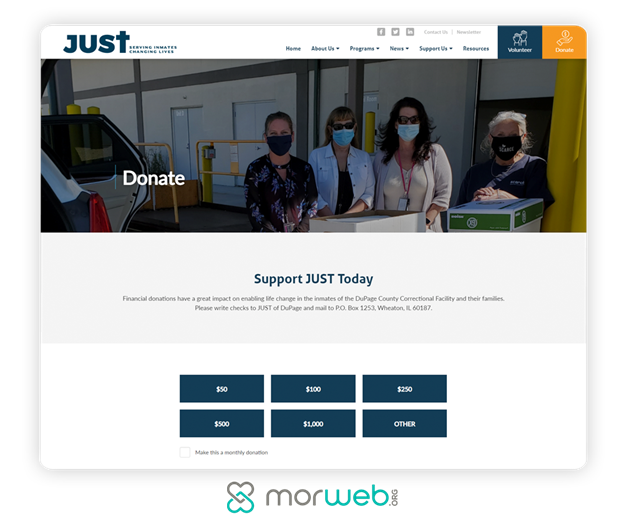
Guides on recurring donations like this one recommend focusing on recurring donors as a way to build sustainable fundraising. One-time donors are always helpful, but recurring donors provide new nonprofits with revenue streams they can count on every month, which makes planning future activities a much smoother process.
If your nonprofit or association offers a membership program, most of the principles around effective recurring donation strategies also apply. As Morweb’s guide to building a membership website explains, you can improve your recurring donation and membership rates by:
- Providing information on benefits of recurring participation. What does consistently supporting your organization accomplish? For membership programs, be sure to list the benefits members have access to. For your recurring donation program, you can provide recurring donors with perks such as merchandise or a yearly calendar, but communicating the impact of recurring donations can be just as effective.
- Offering multiple donation/membership tiers. On your donation form, include multiple suggested giving levels. Placing a lower regular donation level next to higher one-time donation options can convince donors to opt-in to your recurring donation program, which eventually gives more over time. For your members, you can also list the perks of each tier alongside their membership due amount to let your supporters evaluate all of their options.
- Letting supporters control their engagement. Don’t trap your supporters into a subscription program. Give your donors and members the ability to change their donation and membership tiers at their discretion. Doing so may sound counterintuitive, but it can increase the trust your supporters have in your nonprofit. It also lessens your team’s workload as supporters can edit information without having to get into contact with someone at nonprofit each time a change needs to be made.
Be sure to thank your supporters for their participation as well. Monthly thank you’s may feel repetitive, but they let your donors and members know that their contributions and continued support are seen and appreciated. In conjunction with donation and dues receipts, supporters will appreciate having a record of their payments that helps maintain transparency.
5. Matching Gifts
Thanks to corporate giving programs, your donors can likely give more than they first assumed, and your website can tell them how. Matching gifts are additional donations made by corporations whose employees donate to your nonprofit and then fill out the proper paperwork with their employer.
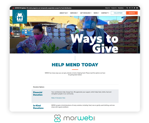
Matching gifts are essentially free, extra donations your nonprofit can earn from qualifying donors. Unfortunately, many of your supporters are likely unaware if they are eligible. According to Double the Donation’s guide to corporate matching gift programs, only 7% of donors who qualify for a matching gift follow through on requesting their employer’s contribution.
Your website can help educate donors on matching gifts by including information about what matching gifts are on your donation page, a dedicated matching gifts page, or your “Ways to Give” page. Explain what matching gifts are and how donors can check their eligibility. You can even assist donors further by adding a search tool to help them find information on their employers’ corporate giving programs.
The Bottom Line
A website is the face for new nonprofits, and each feature that is added informs visitors about what they can expect from an organization. Make the most of your online interactions by maximizing the potential of each visitor’s attention to impact your nonprofit by increasing their donations, while also keeping them interested with an eye-catching, accessible design and new content.
About the Author
Murad Bushnaq is the Founder and CEO of Morweb. Since its inception in 2014, Murad has acted as Creative Director and Chief Technologist to help nonprofits spread their vision online through engaging design, intuitive software and strategic communication.


Leave A Comment