 In the digital era, it’s more likely than not that your supporters are connecting with you via your nonprofit’s website. It’s crucial that you create and maintain an educational and effective website so that your supporters keep returning to learn more. You want to impress your viewers from the very first click, so you may need to dust off some acquisition strategies in your arsenal.
Do you have questions about how to attract and keep viewers on your nonprofit’s website? Let’s dive right into some answers!
Why is effective web design so important for nonprofits?
With limited budgets for digital marketing, nonprofits have to fight an uphill battle to stand out online and build a powerful supporter base. Organizations rely on their websites to raise awareness for their cause and build momentum around their work. So, they need to pull out all the stops to make their nonprofit’s website effective and user-friendly.
In short, your nonprofit’s website is the single most important digital channel for acquiring and retaining supporters.
Simply having your nonprofit’s website isn’t enough, though. To fully connect with visitors, every organization should take the time to make a visually-compelling website that effectively conveys its mission. Otherwise, you may have trouble keeping your supporters on your website and encourage them to engage in online giving.
To fully engage supporters on your website, incorporate these proven strategies into your design plan:
- Start with a CMS designed for nonprofits.
- Feature a well-designed donation page.
- Prioritize the mobile experience.
- Incorporate white space into your design.
- Include calls to action.
A well-designed website can make or break a donor’s decision to engage with your organization. As you read through these tips, reference Morweb’s list of best nonprofit websites to see them at work. Some of these examples may even spark some inspiration for your own design.
Ready to create an effective donor experience through your website? Let’s get started.
1. Start with a CMS designed for nonprofits.
If you’re a part of a small or mid-sized nonprofit organization with a strict budget, the last place you want to spend your hard-earned fundraising dollars is hiring an expensive web developer to carefully create and maintain your website.
If you can’t easily update your website or need external help to do so, it likely won’t get done in a timely manner. And even if you do hire a web designer, they may not know the best practices for nonprofit web design in particular. This is why it’s so important for organizations to invest in an easy-to-use CMS designed specifically for nonprofits.
Nonprofit-specific CMS platforms come with the user-friendly functionality necessary for meeting your online fundraising goals. This is a feature that most generic website builders don’t have. As you get started in your search, here’s a glimpse into some of the other features you should prioritize:
- Customizable layouts. A CMS with simple, customizable layouts will help you easily create and update your website. Instead of editing from the backend of your website, live site editing allows you to watch your vision come to life in real-time. Drag-and-drop elements can streamline the design process further by letting you pick from a set of preset templates.
- Multimedia capabilities. Imagery helps you connect with your visitors on an emotional level and can encourage them to explore your website further. Make sure your CMS allows you to easily add and adjust images and videos. Additionally, look for the ability to add image sliders so you can easily incorporate several images without overcrowding your pages.
- Fundraising tools. When someone is motivated to support your cause, they should be able to do so without leaving your website. To start, make sure your CMS lets you add an on-site donation page with recommended giving amounts and custom fields. You should also be able to build event pages where you can accept online registrations and ticket purchases.
- A straightforward landing page and menu. The last thing you want is your supporters getting confused and frustrated while attempting to use your site. Make sure that your CMS allows you to create an intuitive, user-friendly homepage and menu bar. This will keep users happy while browsing your website and will increase the likelihood of them donating in the future.
The above features are crucial for a straightforward design process. Additionally, the picture below illustrates how an easy-to-use CMS can simplify development while still offering the specific tools nonprofits need:
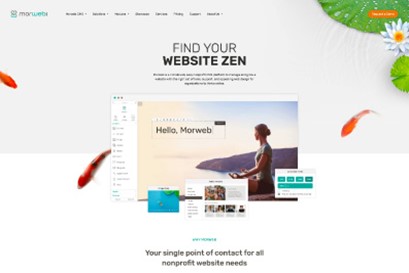
Whether you’re starting a nonprofit or have been part of the sector for a while, the power of a strong, customizable website builder is not something you should underestimate. So long as you have an intuitive CMS, you’ll set your website up for maximum success! Be on the lookout for the features listed above, and you’ll be better prepared to bring your vision to life.
2. Feature a well-designed donation page.
Once you’ve invested in a powerful CMS, you can get started with creating your website. While there are several pages that every effective nonprofit website includes, one of the most important is a donation page. Because landing on this page is the final step before securing a donation, you’ll want to minimize the chance that a prospect will abandon the giving process.
To accomplish this, keep the following tips in mind when designing your donation page:
- Use a minimalist design. Start by including a single compelling image that taps into your donors’ emotions. Too many images can be visually overwhelming. From here, limit the number of information fields. A good rule of thumb is to keep everything on one page. Otherwise, you risk losing prospects part way through the process.
- Incorporate suggested giving amounts and recurring donation options. Use suggested giving amounts to create a frame of reference for donors to use when deciding how much to give. Then, you can add a recurring donation option to encourage long-term support. Just be sure all payment information is protected with secure payment processing.
- Brand it to match your website. Branding your donation page is essential to making it appear trustworthy. Otherwise, users may think they’ve somehow ended up on another organization’s website. Make sure to customize your donation page to match the rest of your website’s color scheme and fonts.
Take a look at some of these donation page strategies in action:
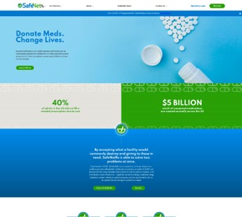
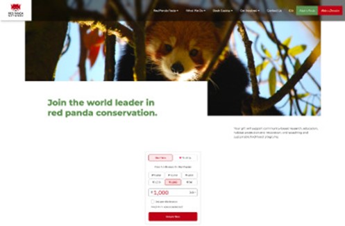
Nonprofits can only thrive when they have adequate funds, and with each passing day, online functionality becomes increasingly essential for this. Make sure your donors can contribute the moment motivation strikes by streamlining the giving process through your donation page setup.
3. Prioritize the mobile experience.
These days, mobile users make up the majority of online traffic. In fact, mobile phones comprise a little over 58% of all website traffic, according to recent studies. In other words, it’s highly likely that potential donors may be viewing your website on a smaller screen. Because of this, you’ll want to ensure that your website is mobile-friendly.
To start, design your nonprofit website on a platform with built-in mobile responsiveness, meaning that each page will adjust to fit the user’s screen size. This way, you can reduce the amount of manual work needed to adjust the mobile view and put more time into creating an effective design.
Not only should your content be viewable, but it should be easy to navigate and interact with on every device. This way, you can effectively connect with a higher number of potential supporters. As you kick off the web design process, start with the following tips to make sure everyone can interact with your content—no matter what device they’re using:
- Design for speed. When it comes to mobile browsing, every second counts. In fact, research shows that if a page loads in one second, the average conversion rate is almost 40%. But if a page takes two seconds to load, that conversion rate drops to 34%. With an on-the-go mindset, mobile site visitors have little patience, so reduce load time by compressing images and reducing the number of animations, videos, and other top-heavy elements.
- Redesign your pop-ups. If your pop-ups don’t scale for mobile, smartphone users will struggle to find the off-screen “X” to close unwanted pop-ups. This can quickly cause frustration, and they may abandon your website altogether.
- Test your website. When it’s all said and done, you’ll need to test your website for mobile usability. Use mobile preview before publishing new content. Then, once it’s posted, have your team check it on their own mobile devices. Take note of any problems and resolve them as quickly as possible.
Here’s an example of an ideal mobile-friendly website:
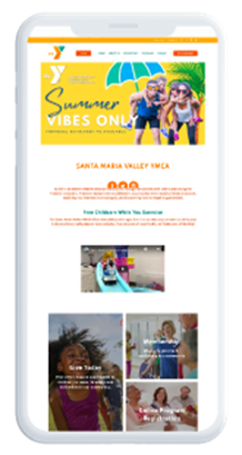
Mobile-friendliness is more important than ever. Without it, you risk higher bounce rates (the rate at which users leave your website after viewing only one page). When you’ve strategically designed your website for mobile users, you’ll create a positive experience that drives engagement.
4. Incorporate white space into your design.
White space, often called negative space, is the portion of a page left empty between design elements. While this may seem like “wasted space” that could be used to house more information, it’s actually an important element of a strong website design.
White space makes your content more digestible. When used effectively, it helps you to balance design elements and better organize content, so users can focus on specific elements without being overwhelmed or distracted by too much information.
As you incorporate white space into your own design, consider these key elements:
- Prioritize text comprehension. Text that’s tightly spaced looks cluttered, but if you space it too far apart, it can make the design seem disconnected. Pay attention to your paragraph margins and line spacing. Ensure it’s all evenly separated to make the content easily scannable and legible. The same principle applies to graphics that include text. For an example of good versus bad uses of text on graphics, visit TopNonprofit’s guide to nonprofit graphic design.
- Draw attention and focus. White space can be used to help build focal points and direct users’ attention to specific page elements. Use relatively large spaces between design elements to guide users through the page and make your core messages stand out.
- Create visual cues. When incorporated appropriately, white space helps communicate the intent of the design by creating a general flow and balance. Its placement can indicate relationships between information. For instance, in the context of a web form, labels should be close to relevant fields to indicate clear connectivity.
Without white space, you’ll risk overcrowding your pages, distracting visitors, and potentially driving away prospective donors. Even though it has its benefits, you should be sure to strike the perfect balance between page elements and the space between them. This way, more prospects will be compelled to interact with your content and continue exploring your work.
5. Include calls-to-action.
These are just a few of the calls-to-action you can use in your web design. They’ll catch your viewer’s eye and emphasize just how important it is to get involved with your organization. Plus, they’re easy to implement and will make a lasting impression on your audience.
Your nonprofit’s website’s main purpose is to inspire potential supporters to take action and help change the world through your organization. Sometimes, they just need one final push to be convinced to support your nonprofit. This is where a call-to-action comes in. It’s a statement that asks your reader to take action for your nonprofit. Instead of a long article or blog post, a call-to-action is short, snappy, and striking. Incorporating them into your nonprofit’s website will convince your audience that their participation matters to your organization.
Calls-to-action can come in many forms. Here are some useful call-to-action phrases:
- Donate now!
- Get in contact.
- Support our cause.
- Join the fight!
- Join our email list.
- Check your matching gifts eligibility!
- Subscribe to our newsletter.
Though web design isn’t often at the top of every nonprofit’s checklist, it should be. Your nonprofit’s website plays a major role in your organization’s digital marketing strategy. It acts as the gateway between your organization and potential advocates with whom you may not have otherwise crossed paths. Overall, it serves as the foundation of your digital presence, so don’t dismiss the importance of the design process.
You’ll need to go above and beyond the bare minimum if you want to reach prospects and keep them on your website long enough to successfully convert them into donors and encourage their continued involvement. Put the tips covered throughout this article into practice, and you’ll be well on your way to engaging more donors on your nonprofit’s website!
About the Author
Murad Bushnaq is the Founder and CEO of Morweb. Since its inception in 2014, Murad has acted as Creative Director and Chief Technologist to help nonprofits spread their vision online through engaging design, intuitive software and strategic communication.


![Build a Nonprofit Website that Works [Steal These Ideas!]](https://getfullyfunded.com/wp-content/uploads/2012/09/AdobeStock_260038257-scaled-500x383.jpeg)


Hi there, You have performed a great job. I will certainly Digg it
and individually suggest to my friends. I’m confident they’ll be benefited from this website.