 Having a well-designed nonprofit website is vital for your organization to further its mission. When potential supporters first hear about you, they’ll likely visit your website to learn more about who you are and what you do. They might even choose to donate online, register for a fundraising event, or sign up to volunteer. But this engagement is only possible when your audience can effectively navigate your website.
When evaluating your nonprofit website’s effectiveness, an important question to ask yourself is whether all possible users can access the content on your site. Designing for accessibility takes into account all audience members’ abilities and situations, allowing everyone access to the information you provide.
To help your nonprofit get started with accessible website design, this guide will walk through the following four best practices:
- Choose Colours Carefully
- Ensure Content Flows Logically
- Focus on Your Navigation Structure
- Display Media in Multiple Formats
As you examine these best practices, you’ll likely realize that accessible nonprofit website design is essentially good nonprofit website design. Consider partnering with a creative design agency that can help your organization implement these best practices and improve your web experience for all users. Let’s dive in!
1. Choose Colours Carefully
There are likely a few colours used across all of your nonprofit marketing materials that represent your organization’s brand. However, designing your website for accessibility means that you’ll have to make careful decisions about how you choose and leverage those colours in your content.
As you build and update your website, always remember to:
- Ensure there is sufficient contrast between text and background colours. The generally recommended contrast ratios are 4.5:1 for standard text and 3:1 for headings and graphics.
- Use coloured overlays when displaying text over photos. This way, the background is a single colour instead of containing varying light and dark shades that could obscure some text.
- Make anchor text for links stand out by underlining it in addition to using a different colour.
- Indicate button hover effects using motion or size differences rather than colour changes.
Choosing colours intentionally improves your nonprofit website’s readability, especially for users who experience colour blindness, have low vision, or are unable to adjust the display brightness on their device. You can find a variety of tools online to help you check contrast ratios and test whether your website provides a positive user experience for colour blind audiences.
2. Ensure Content Flows Logically

Once you know how you’ll use colour on your website, you can make your online communications even more effective by ensuring your content flows logically. Doing so also allows users who rely on assistive technologies like screen readers to experience your website as you intended.
Some aspects of content flow to examine include:
- Heading tag order. In your website’s HTML code, the titles and subheadings on each page will be marked H1 through H6 depending on their size. Each of your pages should have just one H1 tag denoting its title. The rest of your headings will then be marked sequentially—H4 tags flow under H3 tags, which flow under H2 tags, and so on.
- Text formatting. Website copy is easiest to read when it’s at least 16px in size and left-aligned. Also, avoid using all caps except when grammatically acceptable to ensure legibility, like for acronyms and other abbreviations.
- Page layouts. Ensure all of the pages on your website are easy to follow and laid out in a relatively consistent format.
According to Loop’s guide to the best nonprofit websites, the most effective sites are the ones that draw audiences in, instill trust, and prompt action. To accomplish this, make sure to format your copy logically and write it in a concise, meaningful way.
3. Focus on Your Navigation Structure
Ensuring your website has a logical flow extends not only to the content of each page, but also to its navigation structure. Intuitive navigation allows users to find what they’re looking for quickly and easily, making this both an aspect of accessibility and a best practice for nonprofit web design in general.
When developing your website’s navigation, consider the following structural elements:
- Make sure your menu can be navigated using a keyboard. If a user is unable to use a mouse or trackpad for any reason, they should still be able to get to any major section of your site.
- Display links to essential pages in the footer. Audiences should be able to go back to your homepage, about page, contact form, and donation page no matter where they are on your website or whether the menu loads properly.
- Compress image and video files before uploading. Doing so makes them more likely to show up even if users rely on low bandwidths or internet speeds.
Before your website goes live, make sure it functions on all major browsers and devices. This includes optimizing for mobile so that each page automatically adjusts to the screen size it’s displayed on and can be navigated via touchscreen as well as a mouse or keyboard.
4. Display Media in Multiple Formats
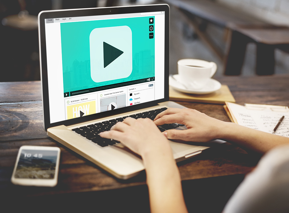
They say a picture is worth a thousand words, which is especially true in website design. As Kwala’s guide to donor communications points out, connecting emotionally with your audience through imagery and storytelling is key to getting them to take action. Keep this in mind when adding photos, infographics, audio recordings, and videos to your website, as these make a stronger emotional impact than text alone. That is, if all users can easily access these types of media.
To improve media file accessibility on your nonprofit’s website, make sure to:
- Add alternative text to images. On the back end of your website, add a short description of each photo or graphic in the box marked “alt text.” This text will show up on the front end if a user’s internet connection isn’t strong enough for the image to load, and individuals using screen readers can use it to understand the image’s purpose.
- Avoid embedding text into photos. Embedded text is often less readable for users than overlaid text. Plus, while screen readers can read out alternative text, they can’t access embedded text.
- Provide transcripts of audio recordings and closed captions for video content. These tools allow users to experience your sound-driven media if they are hard of hearing or in a place where they can’t turn up the volume on their device.
In other words, it’s best to display important content on your website in multiple formats, whether that’s supplementing text with images and videos or ensuring that images and videos can also be experienced through text.
The Bottom Line
Accessible website design can help your nonprofit communicate more effectively by ensuring you don’t alienate audience members with disabilities or unique circumstances. However, accessibility is often a legal issue as well. Use the best practices in this guide as a starting point, and always make sure your website complies with the official accessibility guidelines that apply where your nonprofit operates.
About the Author
Ryan Felix is a co-founder of Loop: Design for Social Good who brings a strong intuition and insight to create bold, creative & impactful websites. Ryan has led design studios in Toronto and New York using his knowledge of Human Centred Design to increase meaningful conversions and design enjoyable web experiences.


Leave A Comment